Original message (4725 Views )
| Spoon 1960th Post

  
Gold Carpet V.I.P- Platinum Executive


|  "Art schools, universities, etc." , posted Thu 27 May 07:03 "Art schools, universities, etc." , posted Thu 27 May 07:03  
My return to school this Sept. is all but set, but one of the things that I realize I could really use is some more education in things associated with the arts. I find myself better equipped to talk with the artists than most other programmers, but I'm still too lacking in knowledge about too many things for my liking.
For you artistic fellows, what sorts of things whether courses or books or other things have you found especially useful in gaining a better understanding of visual art(aside from just unending practice and studying everything)? Also, I am choosing between NYU, UPenn, or Univ. of Utah, so if there's anything really noteworthy at any of those institutions, do tell.
|
|
Replies: |
| Professor 2657th Post

MMCafe Owner
     
| "Re(1):Art schools, universities, etc." , posted Fri 28 May 02:53
quote:
My return to school this Sept. is all but set, but one of the things that I realize I could really use is some more education in things associated with the arts. I find myself better equipped to talk with the artists than most other programmers, but I'm still too lacking in knowledge about too many things for my liking.
For you artistic fellows, what sorts of things whether courses or books or other things have you found especially useful in gaining a better understanding of visual art(aside from just unending practice and studying everything)? Also, I am choosing between NYU, UPenn, or Univ. of Utah, so if there's anything really noteworthy at any of those institutions, do tell.
NYU is located at a very, *very* good area in the middle of the city. I'm not sure about the school itself but as far as the New York experience goes, you'll be hitting it right in the center. The city offers a wide range of fine arts, from the Museum of Modern Art to smaller galleries, and the ever astounding Metropolitan Museum of Art.
Welcome to Southtown.
|
| nobinobita 749th Post

Red Carpet Regular Member+
| "Re(1):Art schools, universities, etc." , posted Sun 6 Jun 01:53:
quote:
For you artistic fellows, what sorts of things whether courses or books or other things have you found especially useful in gaining a better understanding of visual art(aside from just unending practice and studying everything)?
Let me share a secret with you. If you're interested in learning classical, academic, representational art, this is the only book you will ever need:
Cours de Dessin by Charles Bargue:
http://www.geraldmackerman.com/
You can purchase it directly from the publisher here, for much cheaper than Amazon or anywhere else:
http://www.daheshmuseum.org/bargue_promo.php
This is the western art equivalent of a secret Kungfu manual full of arcane power. It's a comprehensive drawing course put together by Charles Bargue, one of the best draftsmen who ever lived. It was a fixture in European art academies from the 1860s up until the post WW2 era where representational art fell out of favor.
The Cours de Dessin is not so well known today, but it's picking up steam again. Alot of professors still incorporate prints from the course into their own classes. And that Dahesh Museum book is the first time in modern history that anyone's gathered all the prints together in one place. It's really really priceless knowledge.
The most interesting thing about the Cours is that it doesn't just teach technique, it teaches sensibility. It is meant to impart a sense of good taste that has been refined through thousands of years of art history. "Taste" is a highly subjective, dicey subject, but I believe that there is a pulse of beauty and dignity to the very refined aesthetic championed in the Cours de Dessin that most human beings can relate to on an innate level. Leafing through its pages, you can see how it has influenced artists world wide to this day (super hero comics and Capcom come to mind immediately--especially the latest work from Ikeno which is gobsmackingly stylized and academic).
If you want to get better at drawing, the Cours de Dessin is peerless.
[this message was edited by nobinobita on Sun 6 Jun 02:03] |
| Spoon 1972th Post
Gold Carpet V.I.P- Platinum Executive
| "Re(2):Art schools, universities, etc." , posted Thu 17 Jun 16:56
Thanks for the replies!
I somehow managed to miss the updates to this thread, or I would've replied sooner :(
I very recently came back from a trip to Philadelphia and New York, where I spent as much time as I could in the museums there. The Metropolitan Museum of Art and the Philadelphia Museum of Art are gorgeous and I could spend days in either. I sadly did not get a chance to go through the Guggenheim (they just have to be closed on Thursday...). Then again, just walking the streets of Manhattan is impressive enough by itself; the juxtaposition of gothic, art deco, dilapadated red brick, romanesque, and international style buildings that are all way too tall among streets that are way too crowded (for me, anyway) was quite an experience. Mind you, I'd been living in city in a prairie province for the past several months, so the contrast was even more arresting.
quote:
BTW is there any aspect of visual art that you want to learn more about specifically? Color theory? Animation? 3d modelling?
I've had a longstanding interest in animation, and I'm intending to do some research in procedural animation methods. I'm incidentally getting more interested in color theory for all kinds of reasons: I'm a wordy person, and whenever I find myself unable to articulate something about something, it bothers me. Since coloring is one of (many) fairly fundamental aspects of how something looks, the absence of those pieces of fundamental knowledge is perceptible.
But since I'm still so raw at it all I'd like to say that it's all interesting to me, but it's unfeasible to study everything.
|
| nobinobita 754th Post
Red Carpet Regular Member+
| "Re(3):Art schools, universities, etc." , posted Thu 24 Jun 14:26
If you'd like to learn more about animation I'd highly recommend The Animators Survival Kit by Richard Williams. It's an incredible instructional book and contains a college education's worth of information. It's one of the most concise, precise and insightful instructional books I've ever read. Even if you're not hardcore into animation it's a great read just to stroll through the mind of someone who has mastery over his kraft and wants to share it with you out of pure love.
Here's the book:
http://www.amazon.com/Animators-Survival-Kit-Richard-Williams/dp/0571202284
And if you really want to take it to the next level, check out the DVD series:
http://www.theanimatorssurvivalkit.com/
If you want to learn more about color... hoo boy, I don't know where to start. I can't recommend any specific books or websites offhand, but I can at least give you a quick outline of the very basics.
Value: This means how light or dark something is. White is the lowest value, pure black is the highest value.
Hue: This is the word that represents what most people think of as color ie Blue, Green, Red etc.
Saturation: This refers to the strength of hue in a color. For instance, a pure bright blue sky is highly saturated. A cloudy, overcast sky is very desaturated and barely blue.
Tint: when you add white to a color it becomes tinted. For example, a tinted red becomes pink, because white + red = pink.
Shade: when you add black to something it becomes shaded.
Tone: When you add grey (black and white) to something it becomes a tone. Pastel colors tend to be tones.
Additional Notes on black and white + color: When you add black and/or white to a color, it becomes less saturated.
Warm Colors: Have more yellow and red.
Cool Colors: Have more blue.
Contrast: Contrast just means the difference in properties between colors. You can have contrast in value (light and dark), hue (how far apart on the color wheel something is) and saturation (how intense the color is).
Primary Colors: The 3 primary colors are Blue, Red and Yellow. When working with physical pigments, you can use these 3 colors to mix any color out there.
*what I just described above only applies to pigments. The mixing of actual light, as in photons, is a whole nother ball game.
**Be careful when mixing paints. There are certain colors meant for mixing, and other ones with hidden properties that don't mix intuitively at all. This used to confuse the hell out of me as a kid.
Secondary Colors: Green, Purple, Orange. These are the colors that come from mixing one primary with another.
When you mix all 3 primary colors in equal amounts you get brown.
Here is a color wheel for reference:
http://www.wordimagemedia.com/neg-space/Color/color_wheel.jpg
Complimentary Colors: These colors are opposites on the color wheel. They are a very fundamental part of western color theory and aesthetics. An easy way to think of it is that a compliment of a color contains all the primary colors it is lacking. So the compliment of yellow is purple (blue+red).
A couple notes on Shadows: In general, a shadows tend to have the compliment of whatever they are falling on. For instance, next time you're in a club and there are colored lights, try to see what color the shadows are. If you're hit with red lights, there's a good chance the shadows will have some presence of green:
http://melacolea.files.wordpress.com/2010/01/club9_470x350.jpg
This isn't always the case 100% in life, but it's a generally good rule of thumb to follow in art. Also, I don't mean to say that a shadow will be the pure compliment of the local color, I just mean that the shadow's hue will be pulled towards the compliment.
If you look at the sprites in SF Third Strike they have all sorts of nice, subtle color compliments going on:
http://www.zweifuss.ca/urien/urien.htm
Urien has a nice brown complexion with a touch of olive green in it. His shadows have hints of red (look at how saturated red the shading is in his fore leg!).
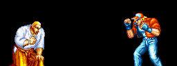
One common mistake alot of beginners make is to just simply shade shadows (ie add black). In Photo shop terms this means going into the color selector and just pulling the color straight down. This gives you very muddy results. Alot of super hero comics use this method. A great deal of SNK games are also colored in this way. If you only shade by adding black, you're missing out on the opportunity for hue and saturation contrast, and those count for ALOT. If you compare old King of Fighters sprites to their Capcom vs SNK versions, you'll see that Capcom makes use of all color contrasts, resulting in a much richer, livelier looking game.
Old Mai:
http://www.fightersgeneration.com/characters2/mai94-stnd.gif
The shadows are more or less just shades. Looks nice, but the colors don't pop.
Cap vs SNK Mai:
http://www.fightersgeneration.com/characters2/mai-cvs2-stance.gif
Lots of contrast in hue, saturation and shade. Much richer looking. Feels more alive.
Another property of shadows is that they're actually more saturated in hue than you might think. This is especially true on the border where light meets shadow, that's generally the most saturated part of a surface. Most Anime understands this theory and uses it to great results. The colorist on the Marvel Comics run of The Dark Tower also understood this very well, resulting in one of the best colored mainstream comics.
http://web.deu.edu.tr/seruven/uploaded_images/DarkTower-791787.jpg
As you can see, the colors are especially saturated on the black borders. If the colorist did not do this, the comic would be dreadful to read. The saturation actually relaxes and eases the transition from light to dark. Coloring something with so many spot blacks is a real tough ordeal, so my hats off to Richard Isaonove for making it all work. I wish all Marvel and DC colorists could be so thoughtful.
For some wonderful examples of awesome master of lights and shadows in classical art take a look at Ingres and Giorodet:
Ingres:
http://www.wga.hu/art/i/ingres/15ingres.jpg
Look at all the colors going on in the shadows! They're so rich! His paintings capture so much more than any camera, especially in the shadows.
Girodet:
http://upload.wikimedia.org/wikipedia/commons/f/fb/Anne-Louis_Girodet-Trioson_001.jpg
I've never seen a photo of Girodet's work that can actually capture all the colors present in the painting. I was lucky enough to see an exhibition of his work at the Louvre and it really blew my mind. His use of colors is... it's like better than real life. You literally can't reproduce his colors digitally. Within the 16 million colors or so that can be replicated on a conventional monitor, there's just not enough power to fully convey the rich and nuanced color contrasts going on in Girodet's work. But enough of it can be captured for study. There's a ton of black in this painting, but look at all the saturation and compliments going on in the shadows.
If you want to see an awesome example of complex color theory in motion in games, look no further than King of Fighters XII (and the upcoming XIII):
http://kofaniv.snkplaymore.co.jp/info/15th_anniv/2d_dot/gallery/character/index.php
Pick ANY character. They all exhibit everything I described above in a streamlined fashion. Look at how much HEAT and SATURATION come off the characters at the point where light and shadow meet. This gives the game so much life. What's even crazier is that they adjust these properties depending on what stage you're in. If you're fighting under the desaturated artificial lights of the stadium at night, the shadows similarly have less complex compliments. If you're fighting under the full spectrum light of the sun outdoors, the colors really pop. The color theory in this game is so wonderfully awesome, so much better than any 3d next gen game out there, so much better than it needs to be, so clearly reflective of the personal passion of the artists involved, so beautiful that it makes me misty eyed whenever i boot this game up. Seriously, i spend more time just looking at it than playing it.
I hope this has been helpful. Thanks for giving me the opportunity to rehash/refresh my understanding of colors. I realize that I'm starting to ramble probably because I've been drinking red wine as I write this. I'll leave you with just a few other notes.
This is an animated color wheel I made during my first year at the Savannah College of Art and Design:
http://studentpages.scad.edu/~rchais20/flash_animations/motionsofcolor.swf
It's supposed to reflect the emotional connotations of color. As the color wheel blooms outward, the colors and their corresponding emotion get more saturated and intense.
This is a link to the website of one of my favorite artists, Okama:
http://okama.nicomi.com/artIllust.html
This guy is a master of color. His use of color is simply ravishing. When I see his work I feel like I'm being acquainted with colors for the first time. He's a master of contrast who is able to make his colors pop and look much more saturated than they actually, scientifically are (context is everything). In my oppinion, he is the best digital colorist in the world. His work is even better if you can see it in print.
Let me know whatcha think! Take care!
|
|
|

